As users, we love when new functionalities come to Vivaldi, and the long awaiting Sync that will come soon, is one of them.
However, when it comes to existing functionalities, we are so used to use them that we do not even think how to improve them.
My aim here is to analyse somes of existing Vivaldi functionalities, compare it to its competitors (if the competitors have the functionality, of course) and what should be improved or added.
Screenshots

Photo by Marc Mueller on Unsplash
In my opinion, screenshots really need a lot of refresh since Opera and Firefox integrated it. I will only talk about Firefox, because Opera has a lot in common with Firefox, which be only repetitive.
To be very clear, Firefox has the best screenshot tool on the market : I really mean it.
Firefox can capture the HTML elements on the page by flying over with the mouse, which is very convenient to capture specific elements on the page instead of selecting a rectangular area. If think this is a must have feature to have in Vivaldi.
Firefox can also capture areas outside the viewport by scrolling with the mouse wheel (Opera can do that too), which is convenient if you want to take only a part of the page.
Firefox has also a much more simple interface. Let see how it works, and then we will compare it to Vivaldi.
Actually, you only press the screenshot button in the address bar, then a pop up appear in the upper right corner :
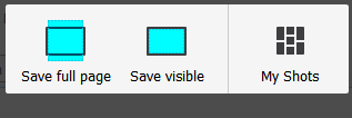
It contrasts with Vivaldi, where you have to click on the screenshot icon, selectioning if you want to take a full page screenshot or only a selection, then choose if you want to download it or paste it in the clipboard. It is far more simple in Firefox.
Notice also, opposed to Firefox, that you cannot make a capture of the viewport, and you want to download the image, you cannot choose the location where it should be located. This is bad.
I think that the Vivaldi team should take a test in Firefox to feel what I describe here : I think they will agree and that adding these functionalities will make a new fresh to the screenshots.
Notes

With Vivaldi, notes are making a comeback since Opera 12.
However, a lot of applications for taking notes are now common, like Evernote or OneNote for example. Why not(e) taking example of them ?
Let’s check OneNote & Evernote functionalities that can be added :
 Tags
Tags
Addings tags (just like in bookmarks) for note will be a cool way to keep things organized. Adding tags to the search bar will also be great.
![]() Differents notebooks
Differents notebooks
In OneNote, you can have several notebooks, which is cool if you want to make different categories to separate some notes from others.
Last but not least : why not making a Vivaldi note app for the web and mobile devices, just like Evernote and OneNote ? It will be lighter that launching Vivaldi Browser everytime you want consult your notes.
Window Panel
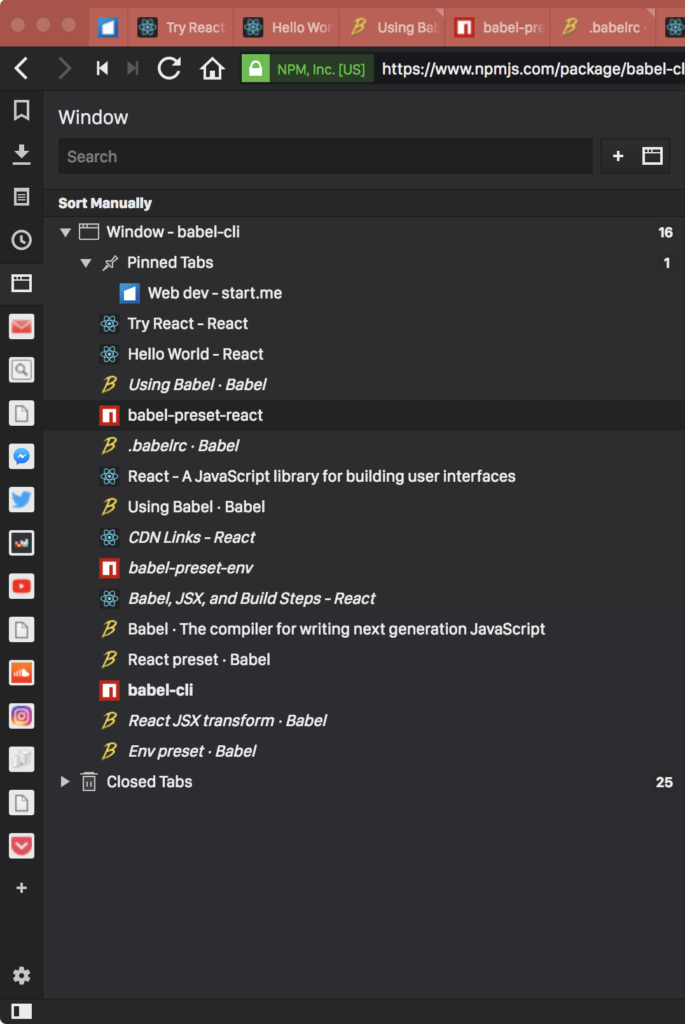
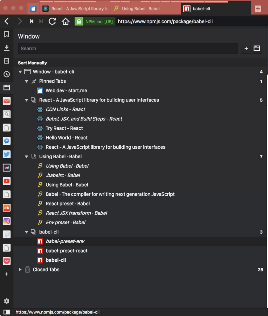
In version 1.13, Vivaldi added the long awaited window panel, which was available in Opera… 12.
However, it misses one cool functionality : the ability to see all the windows with their tabs, like in old Opera :
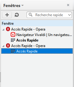
It is very convenient to manage tabs and windows.
Quick commands
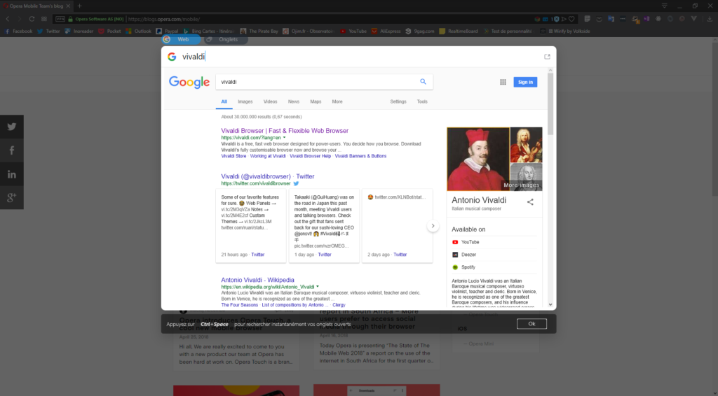
Opera, in version 53 added “instant search” which can preview your research before making a new tabs containing all the results.
It will be great if Vivaldi can also a quick preview like that (in quick command, obviously ?)
With all of that described, I think that it will be a nice new additions to Vivaldi, and also making users happy to see that the Vivaldi continue to support existing functionalities.


